
We’ve worked with several nonprofit teams over the years. Different missions, different budgets, same conversation almost every time: “We know our website needs help. We’re just not sure what ‘help’ means, and we definitely don’t have a big budget for it.”
I love that conversation. Partly because nonprofit work is genuinely rewarding, and partly because nonprofit website design is one of the few places where a handful of smart decisions can change an organization’s entire year.
So here’s the honest version — what actually matters, what doesn’t, and where I see good organizations lose money without realizing it.
Your nonprofit website is a fundraiser, not a brochure
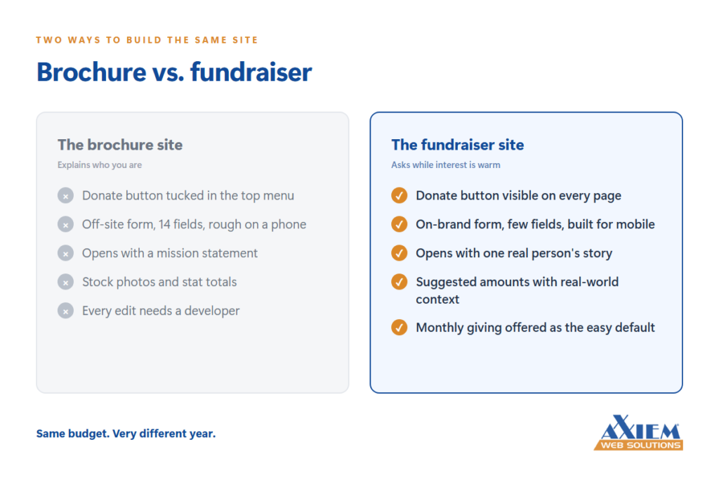 The most common thing we run into is a site built like a printed brochure. Here’s who we are. Here’s our history. Here’s our board. Here’s a photo of the 2019 gala.
All fine. None of it asks anyone to do anything.
A nonprofit website has one primary job: turn a stranger’s interest into an action while that interest is still warm. Someone heard about you from a friend, saw a flyer, read a news story. They’ve got maybe ninety seconds of curiosity. What happens in those ninety seconds is the whole ballgame.
That means the path from “I just landed here” to “I gave, I signed up, I volunteered” needs to be short and obvious. Not buried in a menu. Not three clicks deep behind a mission statement. Right there, above the fold, on the page they land on.
When we rebuild a nonprofit site, the first thing we map isn’t the design — it’s that path.
Make donating effortless
I’m going to be blunt about this one because it costs organizations real money.
If your donate button leads to a third-party page that looks nothing like your site, asks for fourteen fields, and doesn’t work well on a phone, you are losing donations. Not a few. A lot. Most of your traffic is on mobile, and most people will not fight a form on a phone screen to give you forty dollars.
Donation page best practices that consistently work:
A donate button that’s visible on every single page, styled to stand out
A donation form that looks and feels like the rest of your site
Suggested amounts with context — “$50 feeds a family for a week” beats an empty box every time
A recurring option presented as the easy, default-feeling choice
As few required fields as your payment processor will let you get away with
Monthly giving deserves special attention. A donor who gives $25 a month is worth far more over time than the same person giving $100 once, and they’re much easier to keep. If your site doesn’t make recurring giving feel natural, that’s usually the single highest-return fix available to you.
Tell one story, not fifty statistics
Nonprofits tend to lead with numbers because numbers feel credible. We served 4,200 individuals. We distributed 18 tons of food.
Numbers prove you’re real. They don’t move anybody.
What moves people is one specific person, one specific situation, one specific outcome — with a face and a name and enough detail to feel true. Then the numbers land underneath it as proof that the story isn’t a one-off.
Practically, that means your homepage should have a real photo of real people you’ve actually helped, a short piece of their story, and a way to be part of the next one. Not stock photography. Not a hero image of a sunset with a quote on it. The genuine article, even if the lighting isn’t perfect. Especially if the lighting isn’t perfect.
The unglamorous parts of nonprofit web design that matter most
Here’s where we earn our keep, because this is the part nobody gets excited about.
Speed. If your site takes six seconds to load, a big chunk of your visitors are gone before they see anything. Usually the culprit is enormous uncompressed photos, and usually it’s a quick fix.
Accessibility. For nonprofits this isn’t just a legal question, it’s a mission question. If your organization exists to serve people, your website should be usable by people with visual impairments, motor limitations, and older devices. Good color contrast, real text instead of text baked into images, alt text on photos, keyboard navigation that works. Nonprofit website accessibility isn’t expensive to build in from the start. It is expensive to retrofit.
Local search. People search for “food pantry near me” and “after school programs [your city]” constantly. If your site doesn’t clearly say what you do and where you do it — in plain language, on pages built for those searches — you’re invisible to the exact people looking for you.
Someone can actually update it. This is the quiet killer. A beautiful site that requires a developer for every edit becomes a stale site within a year. Whoever runs your communications should be able to post an update, swap a photo, or add an event without filing a ticket. When we hand off a nonprofit site, we spend real time on that handoff, because the alternative is watching good work go gray.
Where to start when the budget is tight
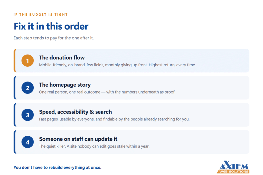 You don’t need to rebuild everything at once. If money is short — and it usually is — fix the donation flow first, then the homepage story, then speed and accessibility, then the ability to make your own edits. That order tends to pay for the next phase.
And ask about nonprofit rates. Many agencies, ours included, work differently with mission-driven organizations. Grant funding for technology is more available than most boards realize, too. The worst outcome is a nonprofit quietly deciding it can’t afford to ask.
Common questions about nonprofit website design
How much should a nonprofit spend on its website? Less than most boards fear, and the number matters less than the order. A focused fix to your donation page often pays for itself in a single campaign, which is why we usually recommend starting there rather than saving for a full rebuild.
Do nonprofits get discounts on web design? Frequently, yes. Many agencies offer reduced nonprofit rates, and technology grants are more available than most organizations realize. It’s always worth asking before assuming the answer.
What’s the most important page on a nonprofit website? The donation page — but the homepage decides whether anyone ever reaches it. Those two pages deserve the majority of your attention and budget.
How often should a nonprofit website be updated? Content, constantly — events, stories, and news should be current. Structurally, a well-built site should last three to five years, provided your team can make everyday edits without calling a developer.
Your mission deserves a website that pulls its weight. Most of the time, getting there is less complicated and less expensive than you’d think. If you’d like a straight answer about where your site is leaking donations, we’re happy to take a look.